How I built a from scratch
Learning
After working on numerous projects with existing design systems, I was given the chance to build a system on project from scratch in early 2024. I was the lead designer on this project with another designer and a researcher. We built the system for ourselves, but with the possibility that later other designers will join the product team.
Having seen a variety of design systems in my career, I had a clearer sense of what worked for me and what didn’t.
While I’ve always enjoyed the opportunity to see how others approach design and to learn from their methods, building a system from the ground up felt like the perfect chance to apply my own approach.
One thing I learned through this process is that building a system isn’t the monumental task it may once have seemed. With the right tools and mindset, it’s not that hard anymore. Having experience with other systems helped me streamline the process and focus on what mattered most.
It's not a to use community resources
I think it’s not a shame to use existing resources to build a design system if it’s a quality resource. I’ve designed so many buttons during my career, it was a relief to find this button set in the Figma community. It has all the states that are needed; I just needed to apply my tokens to it.
For icons, I also used a free and awesome resource that my colleague, Adam suggested. Phosphor icons are well-drawn, amazingly varied, and have all the options you need.

Primitive and colors
I decided to build the project with a barebone token system. For colors, I use Tailwind’s basic color swatches, then extend them with custom primary and secondary colors generated from online tools. These form the primitive layer of the design system.

From there, I built a semantic color layer. It’s easy to overcomplicate this part, but I prefer simplicity. Sometimes complexity is unavoidable, but I try to keep the system easy to use.
After all, this system is built for people, and simplicity helps ensure that it remains intuitive and flexible.
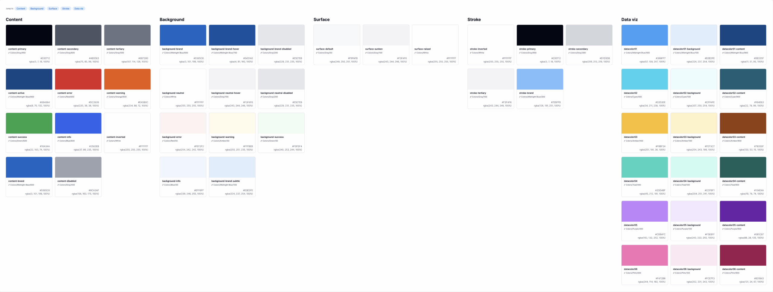
This is the basic semantic color layer I used:
• Background Colors – For text or icon backgrounds
• Content Colors – For text and icon colors
• Stroke Colors – for for lines, strokes, focus states
• Surface Colors – For general surface areas like sunken, elevated
I think this four layers are easy to comprehend, and they are logical when it comes to applying them.
For typography, I followed a similar approach to keep it simple. These are the basic types of styles that were needed:
• Title
• Body
• Button
• Label
• Caption

Other
For sizing and spacing, I used a 4-point system for small elements (0, 4, 8, 12, 16), and transitioned to an 8-point systemfor larger elements (24, 32, 40, 48), with further values divisible by 8 (72, 96, etc.).
I also used T-shirt sizing conventions (XS, SM, MD, LG, XL, 2XL) for spacing, padding, and margins to keep things consistent and clear.
Building Components
As we continued developing the system, I built all screens using components, ensuring consistency and scalability. But design systems shouldn’t feel restrictive. If I identified a need for a new solution, I added it as a component right away. Keeping the system lightweight and adaptable ensures it works for the team and the product.


Building a design system from the start is worth the time and effort, especially when I can take what I’ve learned from other systems and apply it to make the process smoother. The key is having:
- The flexibility to use available resources when appropriate
- A clear understanding of the system’s structure from the beginning
- A focus on simplicity while keeping the system scalable for future growth
By starting with a solid foundation and a thoughtful approach, the process becomes much easier and more efficient in the long run.